Brand Identity
Anderson Health Bill Advisors | 2024
Brand Identity, Visual Systems & Digital Presence
Building a clear, trustworthy brand for a growing service-based business

The ChallengeAnderson Health Bill Advisors was a growing small business providing an essential but often misunderstood service—helping individuals navigate and resolve medical billing challenges. Despite the value of their work, their brand presence did not yet reflect the professionalism, clarity, or trust required in the healthcare advocacy space.
They needed a complete brand identity that would:
Clearly communicate what they do and who they serve
Establish credibility and trust with new clients
Create consistency across digital and physical touchpoints
Support business growth through recognizable branding
This was not just about aesthetics—it was about positioning the business clearly and confidently.

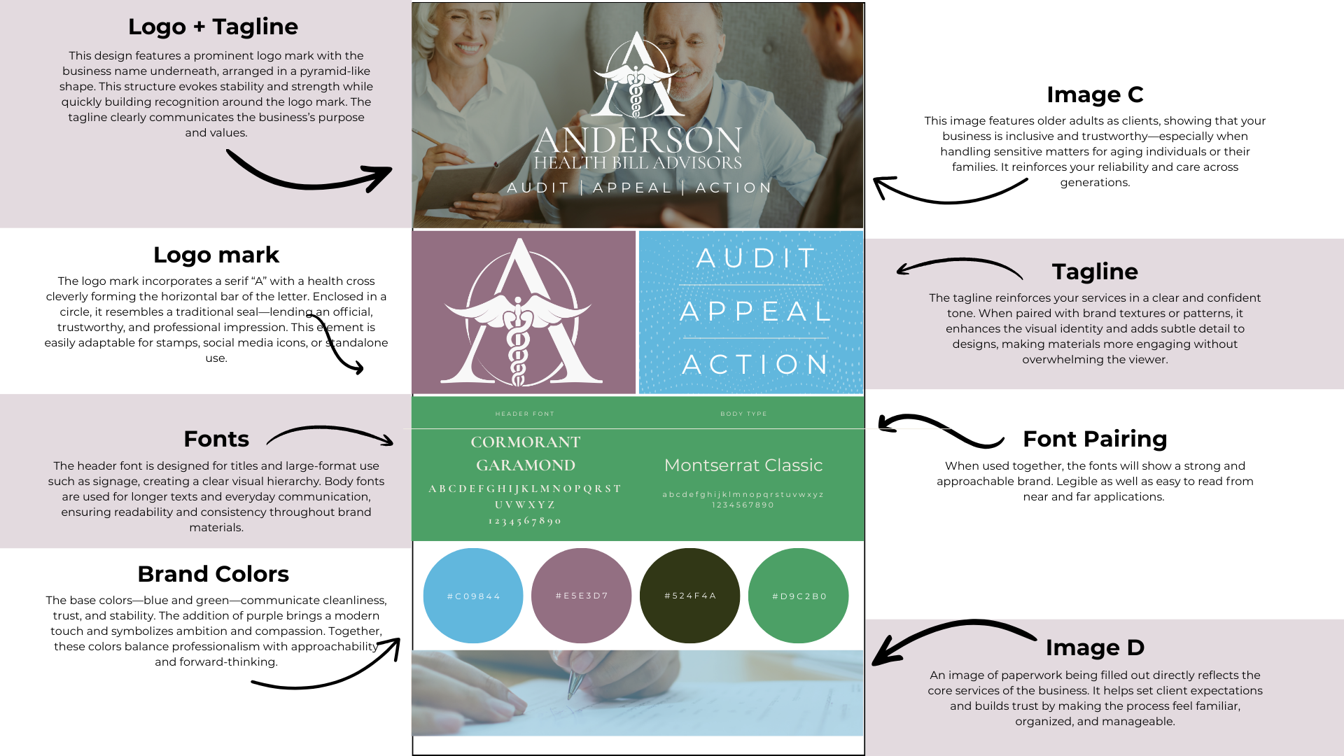
Original Logo
Updated Logomark
Updated Full Logo
The StrategyThe strategy focused on clarity, approachability, and consistency.
Because clients are often stressed or overwhelmed when seeking medical billing help, the brand needed to feel:
Calm and reassuring
Professional but not clinical
Easy to understand at a glance
The goal was to build a brand system that could scale—working just as well on a website or social post as it did on printed materials or merchandise.
The Creative ApproachThe brand identity was designed to balance trust and warmth.
Key elements of the branding included:
Logo design that felt professional, clear, and approachable
A cohesive color palette that conveyed confidence and calm
Thoughtful typography for readability and consistency
Visual elements that reinforced clarity and support
Each piece was designed to work together, creating a recognizable and unified brand experience.
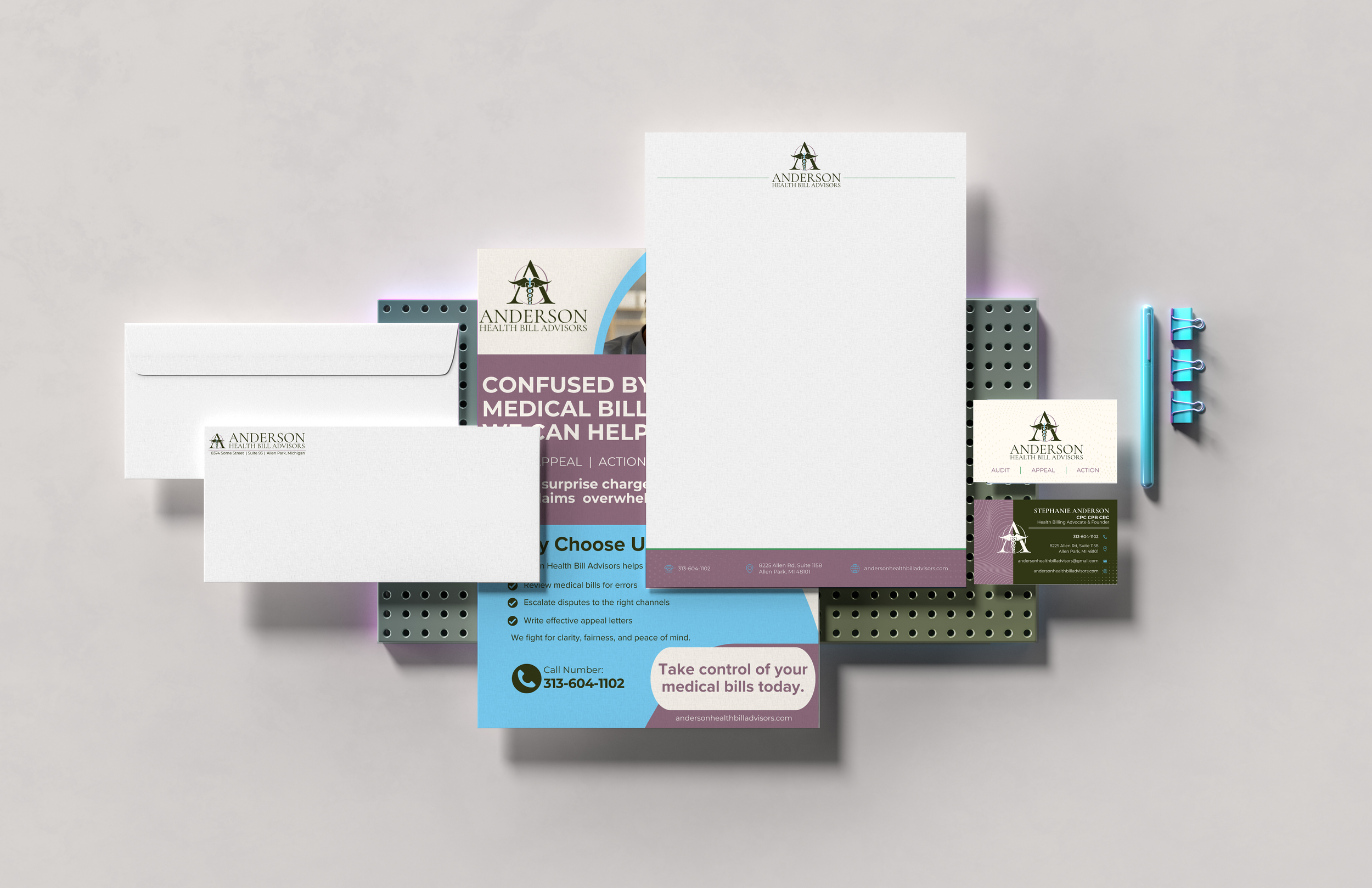
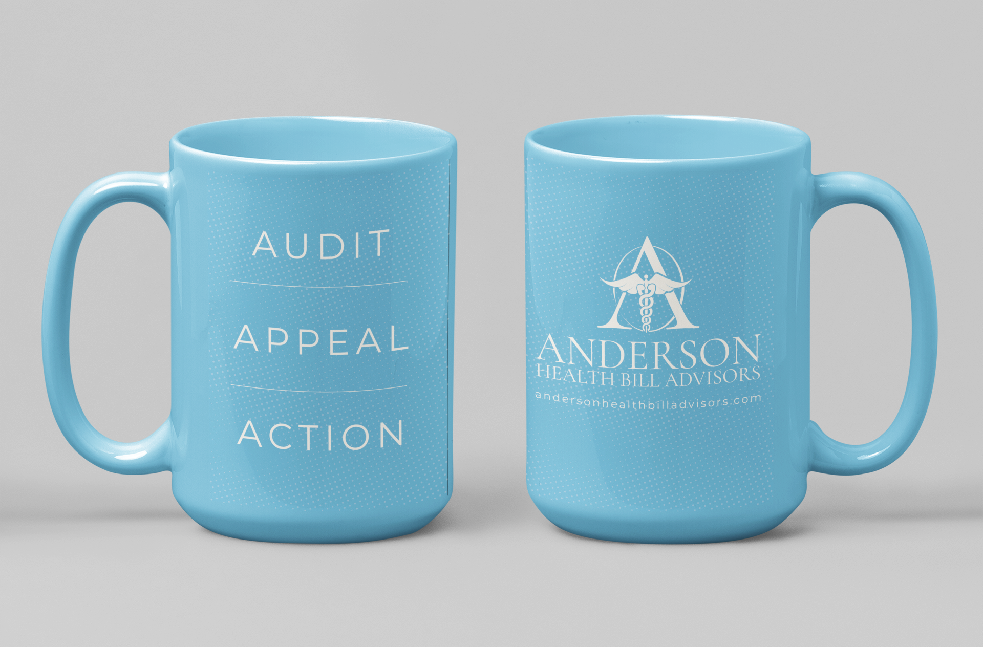
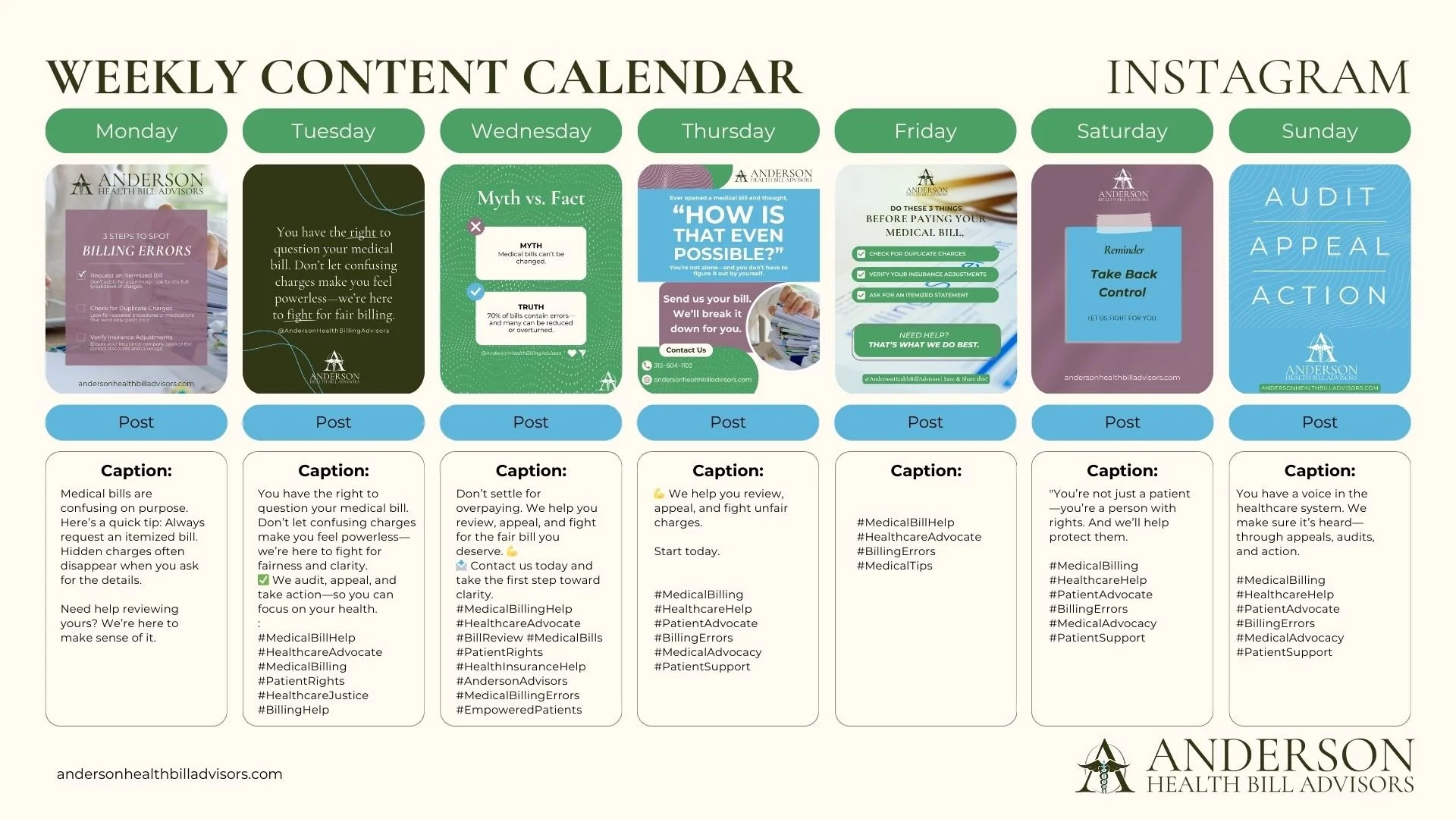
Brand in ActionTo ensure consistency across all client-facing touchpoints, the brand was applied across multiple platforms.
Brand deliverables included:
Logo and brand color system
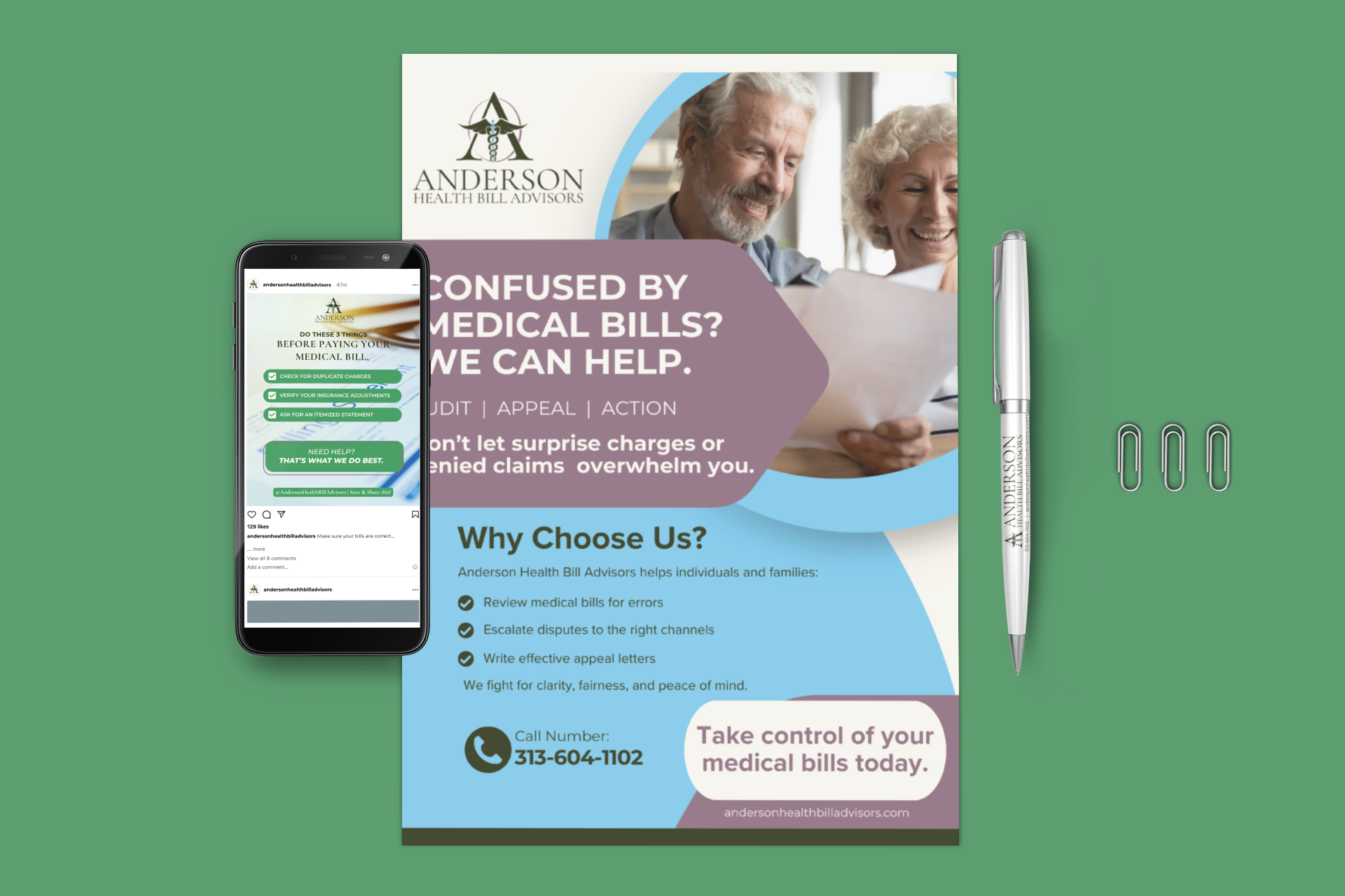
Merchandise and branded materials
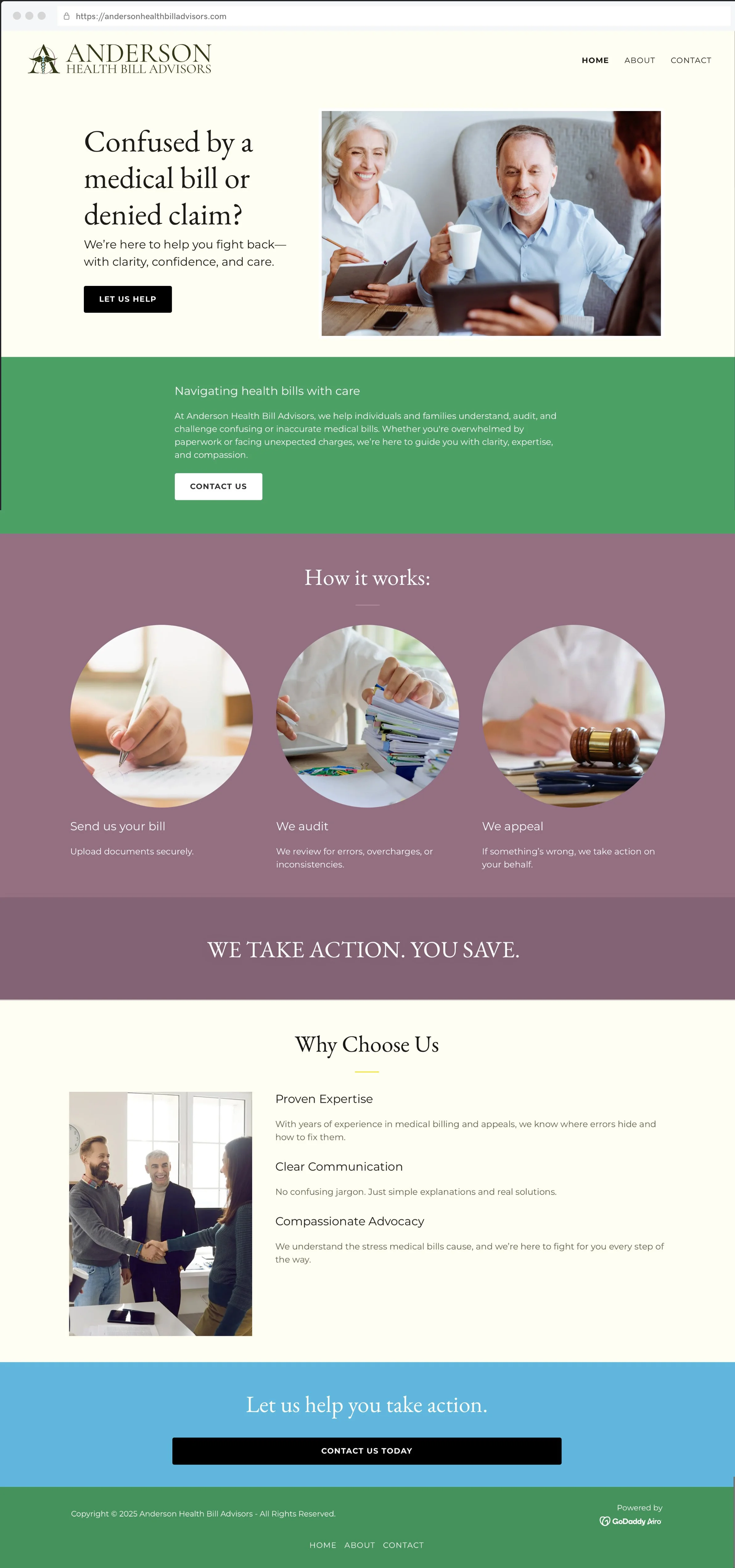
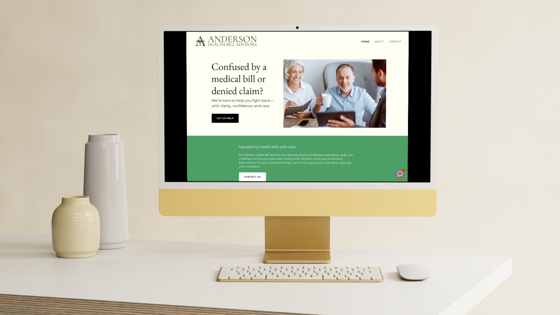
Website design and visual direction
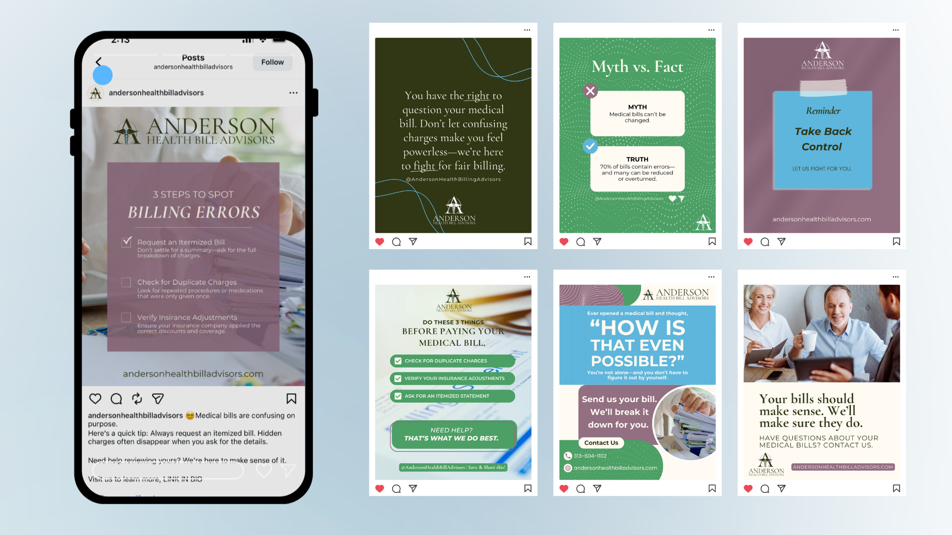
Social media graphics and templates
This ensured the business could show up confidently wherever potential clients encountered the brand.


-
Business Cards
-
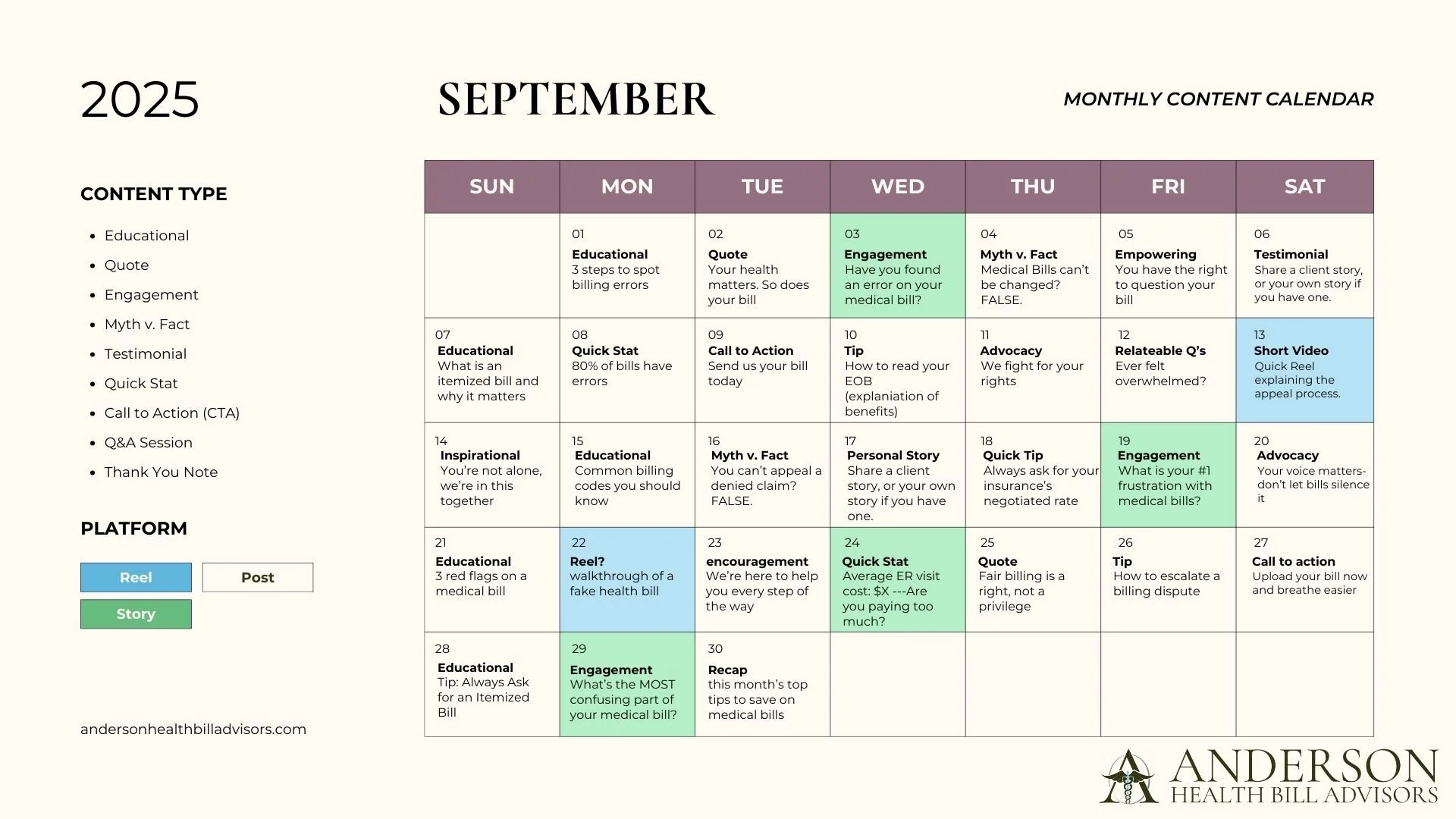
Social Media Plan
-
Merchandise
-
Website
-
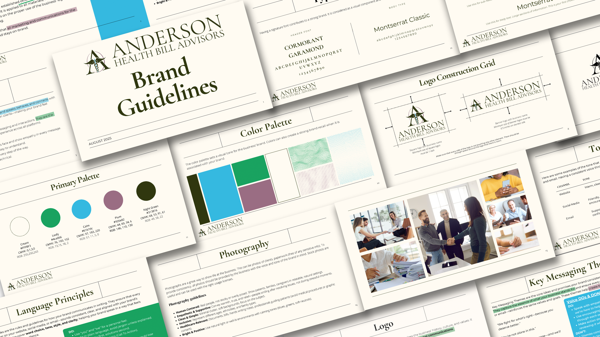
Branding Guidelines
-
Logo
-
Letterhead
- Business Cards - Social Media Plan - Merchandise - Website - Branding Guidelines - Logo - Letterhead
The ResultsThe final brand system:
Gave the business a polished, professional presence
Improved clarity around services and value
Created consistency across digital and physical platforms
Positioned the brand as trustworthy and established
The new branding helped Anderson Health Bill Advisors present themselves with confidence in a sensitive, high-trust industry.
Why This Matters To Future ClientsThis case study shows how strong branding can support small business growth, especially in service-based industries.
For small businesses, this means:
Clear positioning from the start
A brand that builds trust with potential clients
Consistent visuals without constant redesign
A strategic partner who understands business goals, not just design trends
Helping small businesses translate complex services into clear, approachable branding is work I truly enjoy—especially when it supports clients during stressful moments in their lives.