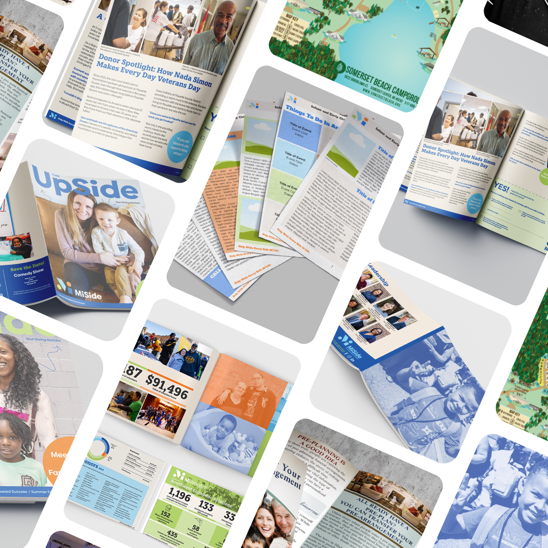
Communication Design
Strong communication is at the heart of great design. These projects—ranging from newsletters to annual reports—showcase how I help organizations share their stories, connect with their audience, and present information in a way that’s both clear and compelling.
Want your communication pieces to inform and inspire? Let’s design something that makes an impact.
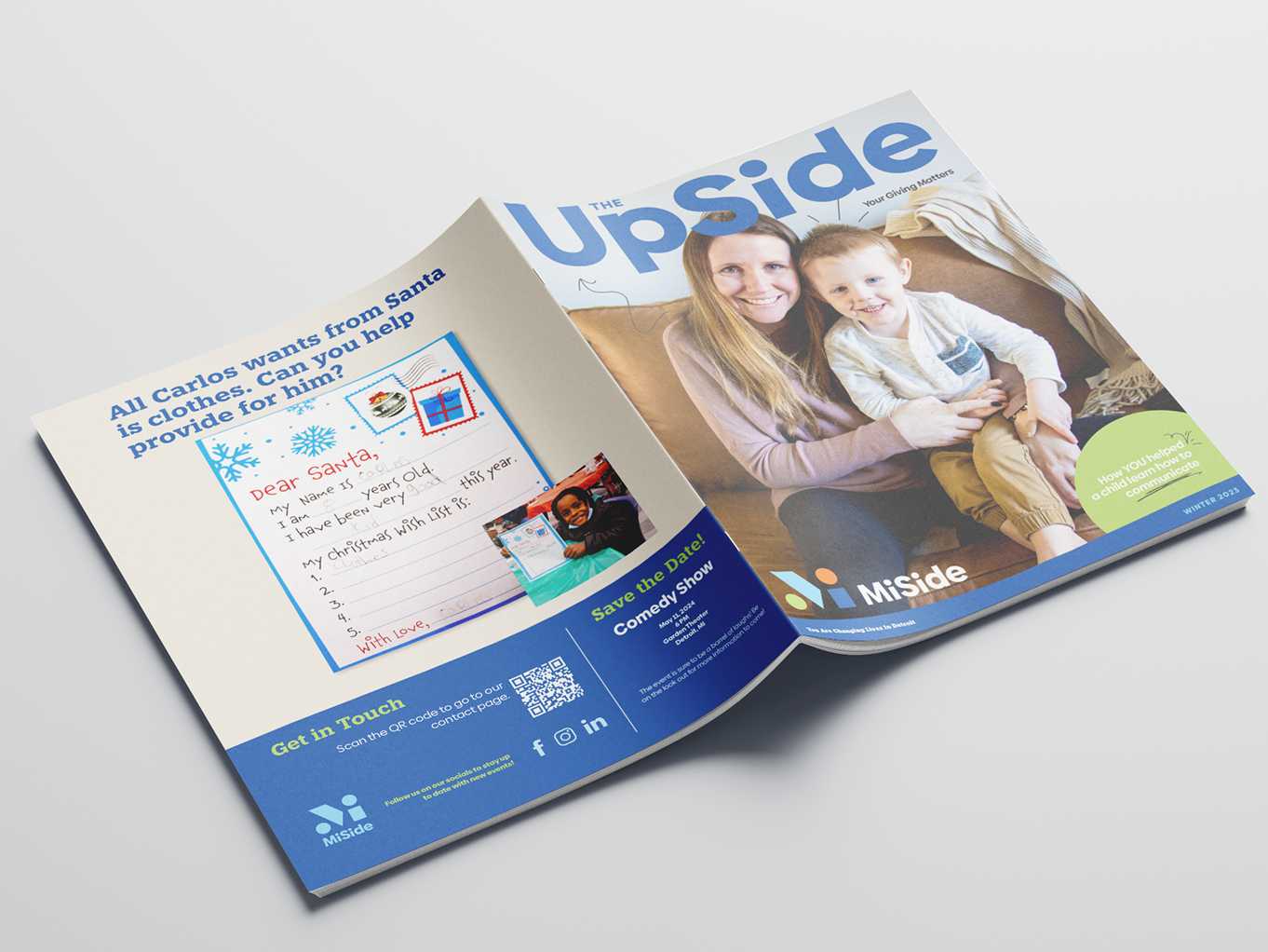
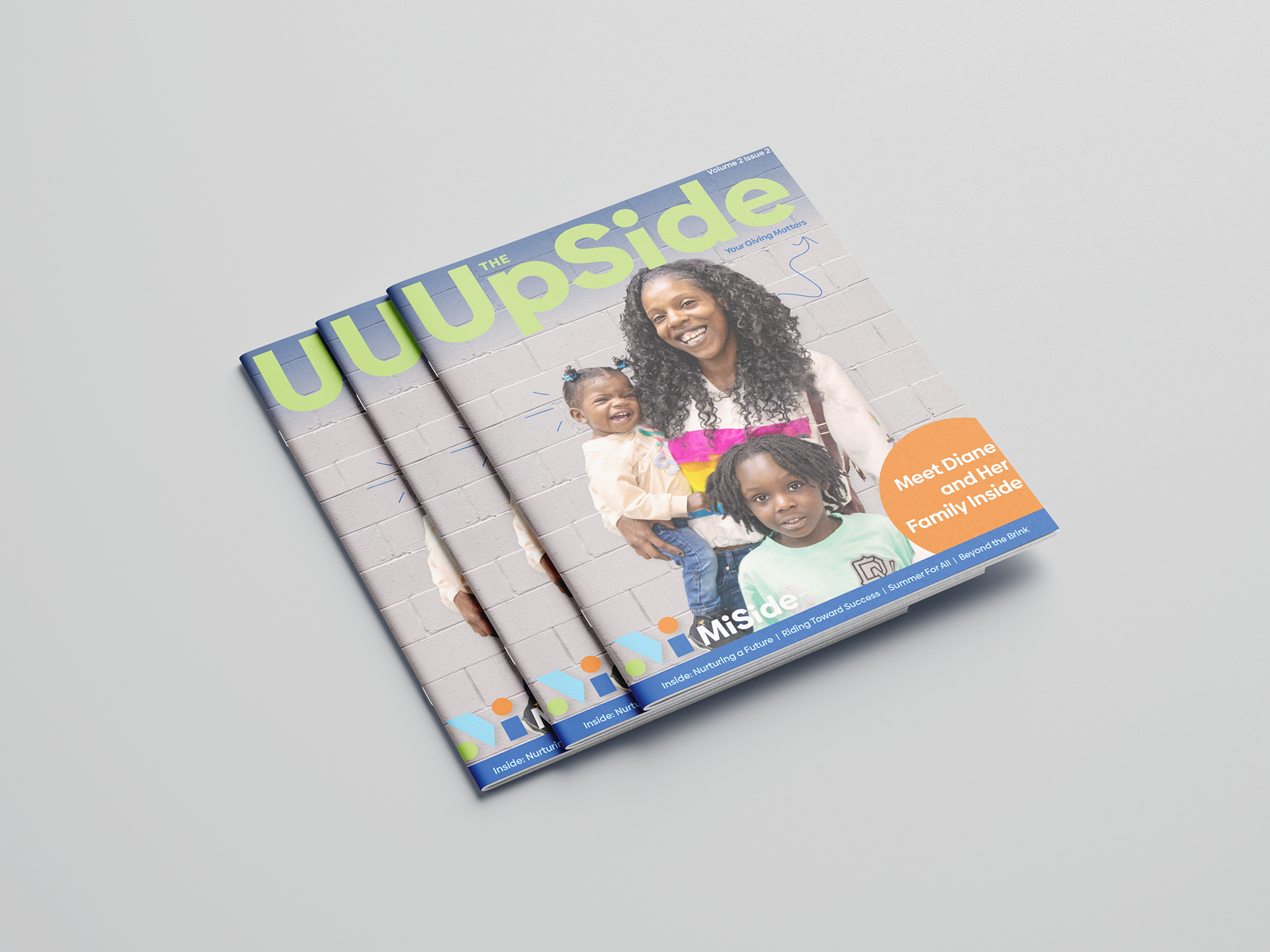
MiSide - Newsletter
2023-2024
The Challenge
These were the first two newsletters published under MiSide, the newly formed organization created from the merger of two separate nonprofits. The goal was to showcase the expanded programs while reinforcing the message that donor contributions continued to make a meaningful impact on people's lives.
One of the main challenges was the lack of a centralized story archive due to the merger. Collecting compelling client narratives from across all programs required additional effort, as there was no existing catalog of impact stories to pull from.
Process & Approach
Following MiSide’s brand guidelines, I focused on creating a layout that emphasized space and brightness, ensuring the design conveyed hope and positivity. Key design considerations included:
Using light and inviting color palettes to maintain an uplifting tone.
Ensuring text readability and logical content flow, using visual hierarchy to guide the reader’s attention.
Highlighting key information with bolded sentences, making it easy for readers to scan and absorb important messages.
Incorporating hand-drawn doodles, a signature element of the brand, to add a welcoming and approachable feel.
The Results
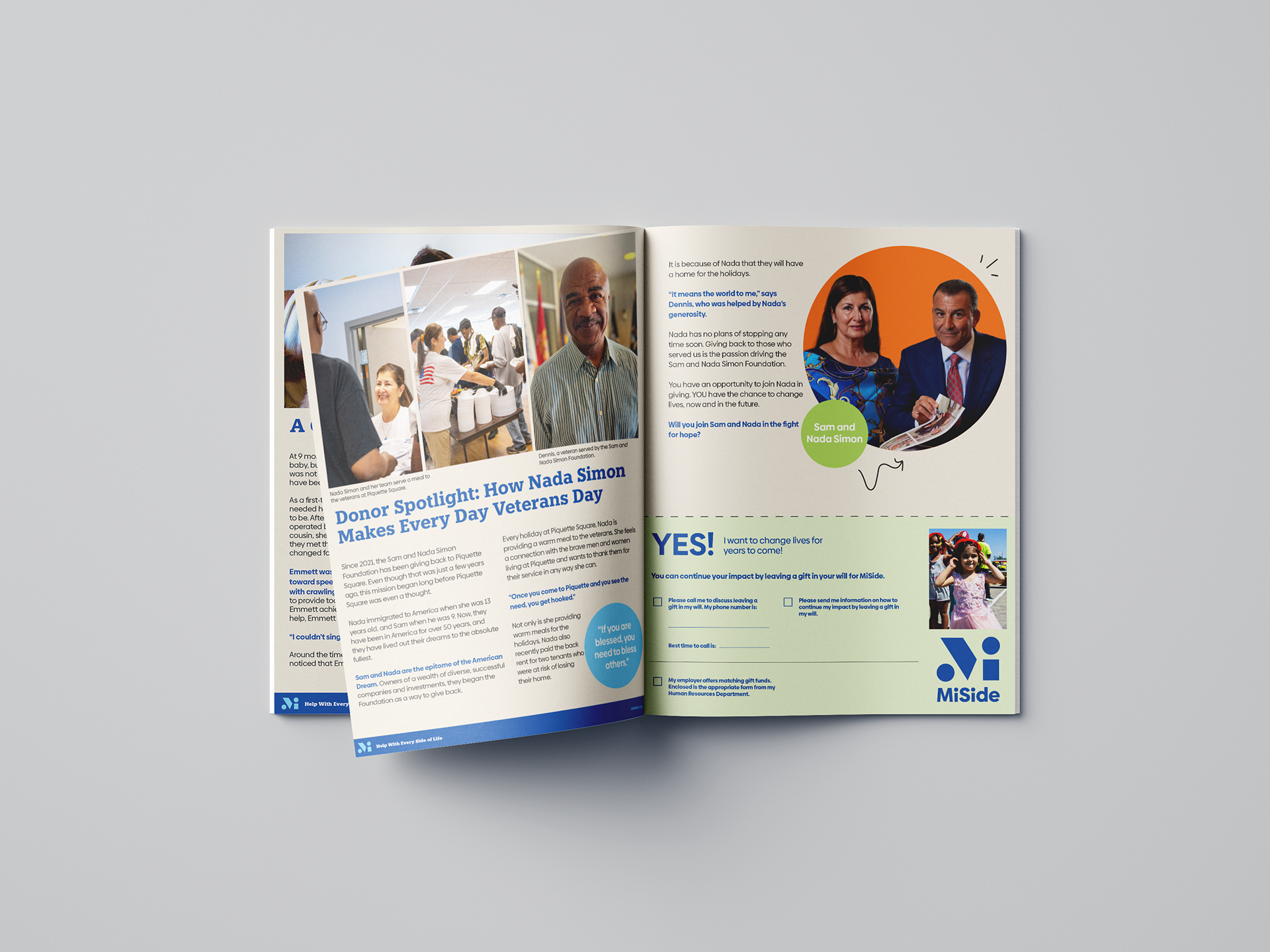
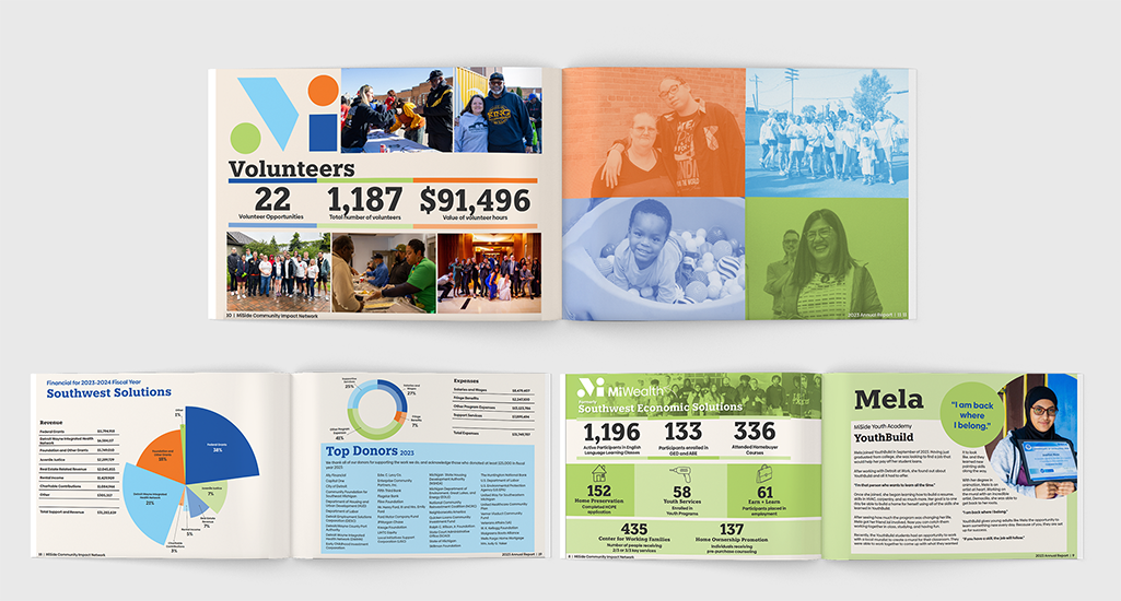
MiSide - Annual Reports
2023-2024
The Challenge
The annual report serves as a critical communication tool for donors and is a state-mandated requirement for operating as a nonprofit. This year’s report posed a unique challenge—it was the first major publication to present MiSide as a unified organization, bringing together two previously separate nonprofits under one cohesive brand.
Our goal was to effectively introduce the new brand identity while maintaining clear distinctions between the two parts of the organization. The report needed to balance storytelling with data, ensuring donors could easily understand both the impact of their contributions and the scope of MiSide’s work in Detroit.
Process & Approach
To bridge the gap between the old and new identities, I focused on:
Clarifying the brand’s visual identity, ensuring the logo and the concept of pillars were easily understood as a unifying element.
Crafting clear messaging to reassure stakeholders that we remained the same organization, now stronger and more comprehensive.
Using bright brand colors to capture attention and maintain visual consistency.
Incorporating real-life photos of employees and clients to emphasize authenticity and community connection.
The Results

EarlyYears - Canva Newsletter Template
2025
The Challenge
The goal was to develop a newsletter template that a team of clinicians could easily use and update on their own each month. The challenge lay in balancing strict brand guidelines with limited design training and capacity on their team. We needed a solution that was both brand-compliant and user-friendly—something pre-built, flexible, and easy to update without ongoing design support.
Process & Approach
We chose Canva as the platform to build the newsletter template, ensuring accessibility for all team members regardless of design experience. The layout was fully designed to align with brand guidelines, with editable sections for text and images. This allowed the team to simply swap out content each month without needing to reformat or redesign, making the process efficient and sustainable.
The Results

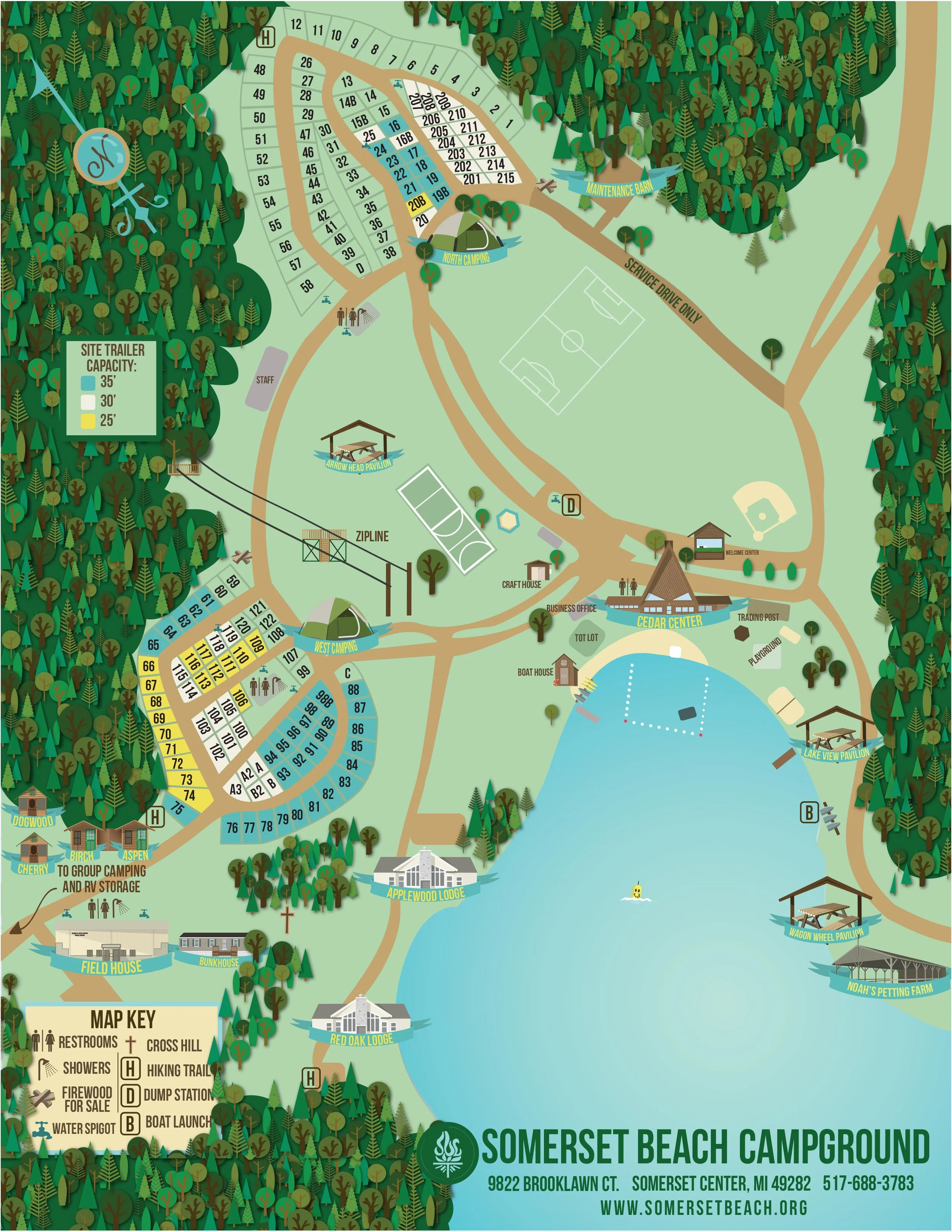
Somerset Beach Campground - Map
2019
The Challenge
The original campground map was outdated, cluttered, and lacked visual clarity, making it difficult for visitors to quickly understand the layout. The challenge was to redesign the map as a communication tool—one that was not only accurate, but also engaging, easy to read, and aligned with the camp’s welcoming atmosphere. The new design needed to clearly highlight key locations using bold visuals and intuitive icons while creating an overall look that felt fun, modern, and family-friendly.
Process & Approach
I took a communication-first approach, focusing on clarity, usability, and visual appeal. Using bold colors, playful illustrations, and custom icons, I transformed the map into a functional yet engaging resource. Each area of the campground was clearly labeled and visually differentiated to help visitors navigate with ease. The final design strikes a balance between practicality and personality—easy to follow, on-brand, and fun to look at.
The Results